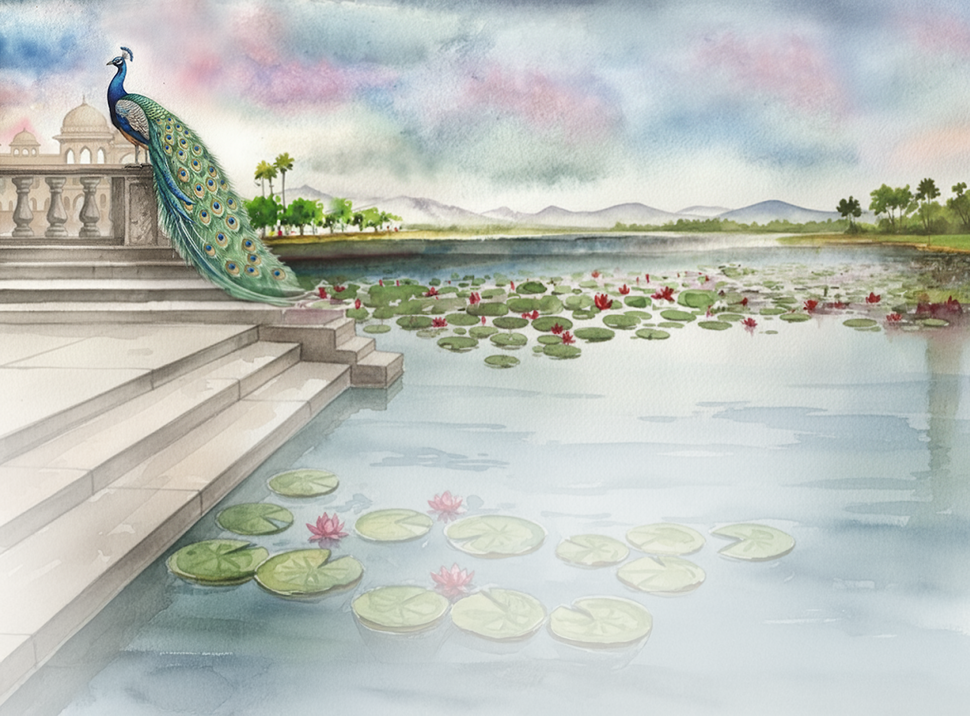
How to Style a Modern Home with Traditional Indian Art (Without It Looking Dated)
Think traditional Indian art only works in heritage homes? Think again. Here's how to bring hand-painted Indian art into a modern space without losing an ounce of sophistication.
What is traditional Indian art for modern homes?
Traditional Indian art for modern homes refers to hand-painted works from classical Indian traditions - including Pichwai, Madhubani, Warli, Gond, and Pattachitra - styled within contemporary interiors. Unlike mass-produced prints, these are original hand-painted pieces that bring cultural depth, craftsmanship, and visual presence to modern living spaces without requiring a heritage aesthetic.
|
Why Indian art is having a moment in modern homes:
|
There's a moment that happens in almost every conversation I have with a potential client.
They've found EthniiChic. They love the work. They're drawn to it. And then they pause and say something like, "But will it look too... traditional in my apartment?"
This hesitation comes up so often that I've started thinking of it as the great Indian art paradox. People have a deep emotional pull toward the art forms they grew up around - Madhubani, Pichwai, Warli, Gond - but somewhere along the way, they picked up the belief that these styles belong in a certain kind of home. Old homes. Heritage bungalows. Grandparents' drawing rooms with heavy furniture and framed mythological prints.
So they put their love for Indian art in a box, and they buy a Scandinavian print instead. Neutral. Safe. Forgettable.
Here's what I want to say to everyone who has ever done that: the problem was never the art. The problem was the styling.
Traditional Indian art doesn't look dated because it is dated. It looks dated when it's placed without intention, surrounded by the wrong colours, scaled incorrectly, or paired with furniture that fights it instead of holding space for it. Fix those things, and the same Pichwai painting that would feel out of place in one home becomes the single most sophisticated object in another.
This guide is about exactly that - how to let traditional Indian art live in a modern space without it looking like it wandered in from a different era.
Start with the Art, Not the Wall
The single biggest mistake people make when trying to incorporate traditional Indian art is treating it like an afterthought. The furniture goes in first, the colour palette gets decided, the sofa arrives, and then they think, okay, now what goes on the walls?
That's working backwards.
In any home where art is genuinely alive - not just decorating - the art is usually what the rest of the room is built around. Or at least, the art is brought into the conversation early enough that it can actually influence decisions. What colour do the cushions go? What shade does the wall get painted? What kind of rug grounds the room? All of these become easier once you know what the art is.
When I work with clients who are collecting pieces from EthniiChic, I always tell them: before you make any room decision, spend time with the art first. Look at the colours in it. Feel the scale. Understand the mood it creates. A Pichwai heavy with deep indigo and gold needs a different room response than a Warli piece in muted ochre on black.
The art tells you what it needs. You just have to listen.
Scale Is Everything
If there is one technical principle that separates a beautifully styled home from one that looks cluttered or confused, it's scale.
Most people go too small. They buy a 12x16 inch painting and hang it on a wall that's eight feet tall. It floats there, lost. The room looks like it tried and didn't quite make it.
Traditional Indian art - especially large-format hand-painted pieces - is made for presence. A single large Pichwai or a sprawling Madhubani composition can hold an entire wall and make everything else in the room feel curated by association.
In a modern apartment with clean architectural lines, one large-scale hand-painted work is almost always more powerful than a grid of smaller ones. It creates a focal point the eye goes to immediately, and it gives the room a soul - a sense that someone with a point of view lives here.
If you're working with a smaller piece, the way to give it appropriate weight is through placement. At eye level, slightly above centre on the wall, with nothing competing with it in the immediate visual field. Breathing room matters as much as the art itself.
Colour Is Your Bridge, Not Your Barrier
The fear that traditional Indian art will clash with a modern interior almost always comes down to colour. Indian art is often rich, saturated, complex. Modern interiors often trend toward neutral, minimal, restrained.
But here's the thing: contrast is not conflict. The question is whether the contrast feels intentional.
A deep burgundy and gold Pichwai panel on a white or pale stone wall isn't a clash - it's drama. It works because the wall recedes and the art advances. The simplicity of everything around it gives the complexity of the art room to breathe.
What actually causes problems is competing colour. If the sofa is printed, the rug is patterned, the cushions are in three different colours, and then a richly detailed hand-painted piece goes up - now you have noise instead of conversation.
The practical rule I work with: if the art is rich, let the room be quiet. If the room has personality already, choose art that speaks one strong language instead of many.
Modern Furniture Doesn't Cancel Indian Art - It Complements It
One of the most beautiful surprises in interior styling is how well traditional Indian art pairs with contemporary furniture forms. Not despite the contrast, but because of it.
Think about a clean-lined Danish sofa - low, upholstered in warm linen - with a large Gond painting behind it. Or a minimalist dining table in pale wood under a Kalamkari-inspired panel. The geometry of modern furniture creates a frame for the organic language of Indian art. Each makes the other look better.
What tends to fail is heavy ornate furniture paired with rich detailed painting. When both the frame and the painting are decorated, they fight each other. The eye doesn't know where to land.
If your furniture is contemporary, your Indian art will look sharp. If your furniture is heavily ornate, pare the art back - choose something with cleaner lines, quieter colour, more negative space within the composition itself.
Placement: The Rooms That Work Best
Not every room has the same relationship with art. Some spaces invite contemplation; others are too busy. Here's how I think about it for traditional Indian art specifically.
Living rooms are the natural home for statement pieces. This is where you want the large-format work, the piece that anchors the room. Position it behind the primary seating - at eye level when seated, not standing. This is where a Pichwai, a large Madhubani panel, or a detailed narrative composition thrives.
Entryways are an underused canvas. The first thing a guest sees when they walk into your home sets the tone for everything that follows. A single beautiful hand-painted piece in the entryway - the right size, well lit - says more about who you are than any other design decision. It's also one of the few places where a smaller, more intimate work can carry enormous weight because it's the only thing competing for attention.
Home offices and studies respond beautifully to art that has narrative depth - work that rewards looking. Gond art with its intricate patterning, or a Pattachitra with its layered storytelling, gives you something to lose yourself in during a difficult call or a quiet afternoon. There's a reason writers and artists have always kept meaningful objects in their working spaces.
Bedrooms call for quieter choices. This doesn't mean less beautiful - it means less busy. A single, serene Pichwai of the moon or lotus motifs. A soft Warli composition that doesn't demand attention but rewards it. Art in the bedroom should give you peace, not puzzle you.
Lighting Changes Everything
Traditional Indian art is made by hand, which means it has texture. Brush strokes. Raised pigments. Sometimes natural materials like stone colours or vegetable dyes that catch light differently depending on the angle.
This is something a photographic print will never give you, and it's something that plain overhead lighting will never let you see.
If you're putting hand-painted work in your home, invest in directional lighting. A picture light mounted above the frame, or a spot from a track lighting system aimed at the painting, will bring out dimensionality you simply cannot see in flat light. The painting you thought you knew becomes a completely different experience.
This is one of my strongest recommendations to anyone building a collection: light it properly. The art deserves it, and you deserve to see what you actually own.
The Gallery Wall Question
Gallery walls are everywhere right now, and the question I get is whether traditional Indian art works in one.
The honest answer is: it depends on what else is in the gallery wall.
When it works: a curated arrangement of works from the same tradition, or different Indian art forms that share a colour story. A wall of three or four Madhubani works in different sizes. A arrangement that includes a couple of hand-painted pieces alongside neutral photographs or simple line drawings. The key is that something creates unity - either tradition, colour, or visual weight.
When it doesn't work: mixing detailed hand-painted Indian art with maximalist graphic prints, photographic portraits, neon signs, and quote art. The art gets lost in the visual noise and ends up looking like it doesn't belong anywhere.
Traditional Indian art is not shy. It needs to be in conversation with things that understand it, or it needs to stand alone.
A Word on Frames
Framing is one of those decisions that seems minor until you get it wrong, and then you can't unsee it.
Heavy ornate gold frames on traditional Indian paintings is the cliché that makes modern buyers nervous. It reads as heritage rather than contemporary, and it can pull even a beautiful work back toward that "grandmother's drawing room" feeling.
For modern interiors, I lean toward simple float frames in natural wood or thin black profiles, or sometimes no frame at all if the work is on canvas and has clean edges. This lets the art speak without the frame editorialising on its behalf.
If you do want gold - because some works genuinely call for it - go with a thin, refined gold leaf profile rather than something carved and heavy. The difference is significant.
One Mistake Even Careful Buyers Make
Here's something I've noticed over years of working on these pieces and watching them go into homes: people sometimes undervalue the importance of where in the room the art sits, not just which wall it's on.
A painting hung too high is one of the most common errors in home styling generally. We tend to hang things at the height that feels natural when we're standing up, which puts the centre of the painting at eye level for someone who is six feet tall, walking past. But in a living room, the experience of art happens when you're seated. Which means the centre of the painting should be at roughly seated eye level - around 57 to 60 inches from the floor.
Lower than you probably think. But right when you're actually in the room.
Building a Collection Over Time
One painting can change a room. A considered collection, built over time, can change a home - and change the person who lives in it.
What I notice with clients who collect is that the process of acquiring meaningful, hand-painted work shifts how they think about their home generally. They become more intentional. They start editing rather than accumulating. They understand, at a bone-deep level, the difference between a room full of things and a room that means something.
If you're starting from a place of wanting one beautiful piece, start there. Get it right. Live with it. Notice how the room feels different. Notice what the art does to you across different times of day, different moods, different seasons.
And when you're ready for the next one, you'll know exactly what it should be.
The Short Answer to the Original Fear
Traditional Indian art doesn't look dated in modern homes. Poorly considered styling does.
The art itself - Madhubani, Pichwai, Gond, Warli, Kalamkari - is hundreds of years old and still completely alive. It has survived empires, migrations, colonisation, and globalisation. It doesn't need your modern interior to validate it. It needs your modern interior to hold it with the same respect it deserves.
Do that - give it scale, light it well, let the room quiet down around it, place it at the right height - and what you'll end up with is a home that doesn't look like a catalogue and doesn't look like a museum.
It'll look like yours.
EthniiChic creates bespoke hand-painted pieces inspired by India's classical art traditions. Each work is designed by Roshni and painted by our team of artists - made to live in real homes, not just on mood boards.
[Browse the current collection → Click here] | [Commission a custom piece → Click here]
Frequently Asked Questions
1. Does traditional Indian art look out of place in a minimalist home?
No, and the pairing often works better than people expect. Minimalist interiors with neutral walls, clean-lined furniture, and restrained colour palettes provide exactly the contrast that makes a hand-painted Indian work come alive. The simplicity of the room gives the complexity of the art room to breathe. The key is scale: choose one significant piece rather than several small ones, and let the art be the single point of visual richness in the room.
2. Which Indian art style works best in a contemporary apartment?
For contemporary apartments, Warli art (white geometric figures on a dark ground), large-format Pichwai panels, and Gond paintings tend to work best. Warli reads as graphic and modern while being rooted in an ancient tribal tradition. Pichwai brings colour drama that transforms a neutral room. Gond's intricate patterning adds visual depth without feeling decorative. Madhubani works beautifully but needs a quieter room around it, it doesn't share visual space well.
3. What size Indian art painting is right for a living room wall?
For a standard living room wall (8–10 feet tall), a painting of at least 24×36 inches is recommended as a starting point. For a sofa wall, the art should be roughly two-thirds the width of the sofa to feel proportionate. The most common mistake is going too small - a 12×16 inch piece on a large wall looks lost. When in doubt, go larger than feels comfortable.
4. At what height should I hang Indian art in my living room?
The centre of the painting should be at approximately 57–60 inches from the floor - which is eye level when seated, not standing. This is lower than most people hang art intuitively. In a living room where the primary experience of the art happens when seated on a sofa, this height ensures the painting is in your field of vision naturally.
5. Can I mix multiple Indian art traditions in the same room?
Yes, but only when something creates visual unity between them. The safest approach is to unify by colour - choose pieces from different traditions that share a palette. A Pichwai and a Madhubani in the same room need a colour bridge. Mixing without any unifying principle creates visual noise rather than a curated collection. As a general rule, limit to two traditions per room and ensure they don't compete for the same visual register (both cannot be the loudest thing in the room).
6. Do I need to frame hand-painted Indian art?
Not always. Canvas paintings can be displayed unframed if they have clean, finished edges. For works on paper, board, or fabric, framing protects the piece and finishes the presentation. If framing, avoid heavy ornate gold frames for modern interiors - they pull the work toward a traditional aesthetic. Simple float frames in natural wood, thin black profiles, or minimal gold leaf profiles work far better alongside contemporary furniture.
7. How do I light traditional Indian art correctly?
Directional lighting is essential for hand-painted work because the paint surface has texture - brushstrokes, raised pigments, slight irregularities - that only becomes visible in raking light (light from a sharp angle). A picture light mounted above the frame, or a track spotlight aimed at the painting from above, will reveal dimensionality that flat overhead lighting completely hides. This is particularly important for stone-pigment Pichwai work, where the mineral quality of the colour only shows fully under good directional light.
8. Is Indian art a good investment for my home?
Hand-painted Indian art is a strong long-term investment in two senses. First, genuine hand-painted work by artists trained in classical traditions holds value and often appreciates - works from recognised traditions like Pichwai and Madhubani have seen significant price appreciation in the auction market over the past 20 years. Second, unlike decorative prints, hand-painted work provides daily aesthetic return - it changes with light, rewards continued attention, and does not depreciate visually the way a print does.